|
Cumulative statistics can be a tricky thing. How often does the baseball world see a prospect or a young hitter come up, make a huge splash by hitting 4 home runs in his first 3 games and then end up back in AAA by mid-season? I've always been curious as to why that happens. Is it adrenaline? Is it because the pitcher has no scouting report on this new hitter and thus just lobs a 'whatever' right over the heart of the plate?
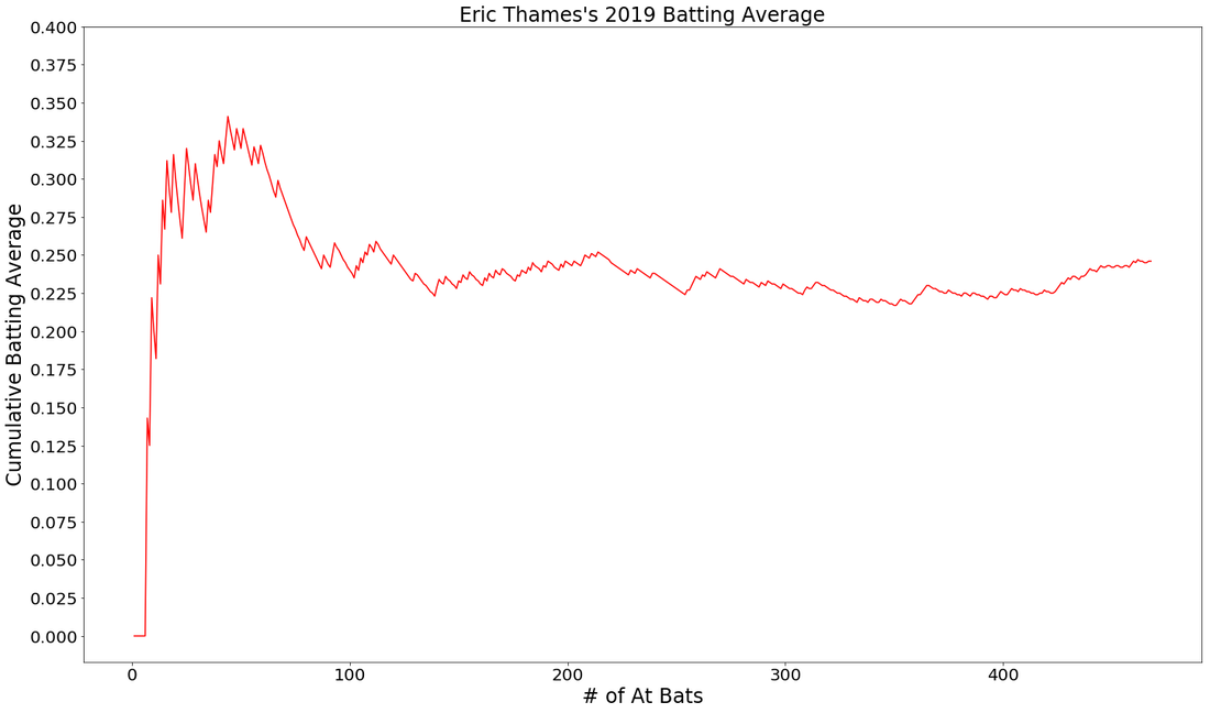
I think back to Eric Thames and the incredible start he had in 2017, hitting homers like a mad man in his 'back for revenge' season after playing in Japan the previous year. Let's just say, Thames went off! But, it didn't last long. By the end of his first 100 AB's, he started to come back down to earth or, regress, as it is. Eventually, a player regresses back to what would be closer to a career average. This post isn't about regression, it is simply showcasing a function that will allow python users to visualize a cumulative statistic, in this case, batting average. When downloading Baseball Savant game data, there are a few things that need to be fixed up before you can visualize a player's average over the course of the season. See the function below and the comments for all the steps I took.
Now that you have your data, you've cleaned it up and you're rounding 2nd, it's time to visualize!
By visualizing and looking at Thames over the course of the season, we can see this hot start didn't last long.
Let's take a look at a few examples of younger hitters. These graphs are fun to look at because we don't really know for sure what they are expected to regress to because they've haven't played much. Here you see 2nd year Juan Soto and Rookie Bo Bichette.
NOTE: I dropped these batters first 2 AB's if they got hits, just to remove 1.000 from the image. 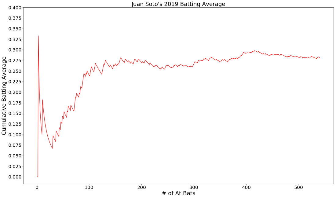
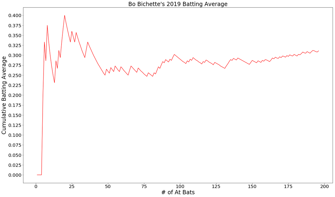
Will these images allow you to deeply evaluate a player or make clear projections? Probably not. But, they do allow you to see that cumulative stats, like a batting average, can tell a story. With vertical markers we could point out injury spells, slumps, streaks and other points in time where there was some kind of influential side note. If you could only look at these graphs, which hitter would you rather have on your team in 2020?
0 Comments
I have a plan, that is, once the baseball season finally kicks off. Don't tell anyone, ok? I'm going to try to Beat The Streak. The streak is one of baseball's seemingly most unbeatable records. The record is 56 hits by a baseball player in consecutive games. Joe Dimaggio got a hit 56 games in a row in 1941. The only player to have even come anywhere near this record in my lifetime was Jimmy Rollins in 2005 and 2006, a continuation from one season to the next that some baseball purists would place an asterisk next to.
For those of us who mostly interact with the great game of baseball through computer screens, MGM has given fans a chance to hit 57 consecutive games in a row and win $5.6 million. MGM has even made it much easier for fans. You don't have to choose 1 player that you think will hit 57 games in a row, you can choose many MLB players to accumulate hits. The only requirement is that the player you've chosen must get a hit the day he is chosen. Choose correctly, you add another hit tally to your mark. Choose incorrectly, you go back down to zero. Your goal is to choose 1 player each day to get a hit and do that 57 times in a row. In case your confused, let's go through an example. Day 1: I choose Manny Machado, he get's a hit! Hit tally = 1 Day 2: I choose Nolan Arenado, he get's a hit! Hit tally = 2 Day 3: I choose Trea Turner, 0-4, no hits. Hit tally = 0 It's harder than you think. No one has succeeded in 16 years, but some have come close. I've played for a few years now and I don't think I've every gotten past 15. Now, rather than going in blind, here's my plan to use machine learning and predictive analytics to Beat, The, Streaaakkk!! * Hopefully baseball comes back and MGM continues this contest so that all this work is actually useful 
Step 1.
What I need to do is.....wait....this is a contest in which I could potentially win $5.6 Million. Do you really think I'm going to spell it all out for you right here, right now? In truth, predicting a hit in a baseball game is difficult. How difficult? A few mathematically minded individuals posted on Reddit about just that. So, knowing that the chances of building a successful and sound predictive model to win this contest are, let's say, slim...what the heck! Hopefully if you're reading this and you see some flaws or suggestions, you can point them out and we can try to, "Beat, The, Streeeaakk!", together. Step 2. I've downloaded as much batted ball data as I can from Baseball Savant and I think it will be enough. With 40,000 events and 89 individual features, I've certainly got enough to get started.
Step 3.
Designate and create the target column. I'm trying to predict a hit. A hit can be a single, double, triple or home-run. Anything else, won't do. In my dat, I have two columns, "events" and "description", that need to be investigated. See code below:
Step 3 cont,.
I need to turn the 'events' column into a hit/non-hit categorical column that will be used as my target during modeling. Here's a function built to label these occurrences as a hit/non-hit.
Step 4.
Gathering this data was pretty easy. Now, I have clean it up and do some exploring. Tune in to my next post showcasing interesting visualizations and findings!
Knowing what is happening under the hood of different types of algorithms is important. I was once asked in an interview to explain a project that I had worked on and I decided to talk about my favorite portfolio project that tested a variety of algorithms to predict the likelihood of an MLB baseball player receiving the Gold Glove Award at the end of the season based on their season defensive metrics. I was happy with the way I explained my project and how in the end, an AdaBoost classifier was the best algorithm for my model. My interviewer nodded, expressed his intrigue and then, asked me to break down what the AdaBoost model does and how it works under the hood.......
Que stumbling, rambling, vocalized proof that I don't actually know the real details but I know it's better and uses like....more trees???....or something like that??? Before an interview you prepare and study and practice and talk to yourself in the mirror and there's always a question that will come up that you are unprepared for. So, I took notes on what I missed, hit the books to study up on the question I got wrong and here is how I would explain it if I could go back in time. I hope this helps you prepare for better explaining the details behind various ML algorithms. First, let's cover the difference between strong learners and weak learners. A weak learner is any model that does, just, good. It is predictive and it does better than random chance, slightly better that is. It can really be any kind of model or algorithm, but for the purpose of this exercise, think of it as a simple, shallow, non-tuned, vanilla decision tree. Now, think of strong learners as more than just that one simple, shallow, non-tuned, vanilla decision tree. Think of a strong learner as a random forest. Whereas before, we only had 1 tree, now we have multiple trees, each learning from a random subset of your overall training data (a technique called bagging) and each tree trains itself enough to make the forest model a strong learner, predicting better than random guessing. Weak Learners: Simple models that do only slightly better than random chance. Strong Learners: Models with the goal of doing as well as possible on the classification or regression task they are given. Examples include ensembles like random forests and boosters, A boosting algorithm is similar to that of a random forest because it ensembles trees together. First, a boosting algorithm will train a simple weak learner. It then evaluates which examples the weak learner got wrong and builds another weak learner that focuses on only the areas that the original got wrong. It continues doing this, building an overall strong learning model by iterating and building a more predictive and better trained or 'boosted' tree. Think of it as the algorithm looking back to see what went wrong, and giving the decision tree a little boost in the right direction. In the image below, you can see that the plus and minus signs change at every iteration. The first iteration is a very weak learner and at every iteration, the learner gets stronger. As the pluses and minuses are guessed right and wrong, their weights decrease and increase respectively. In the end, boosting has created a strong, predictive learner by starting with the a weak learner. It's a good old fashion strength boost! 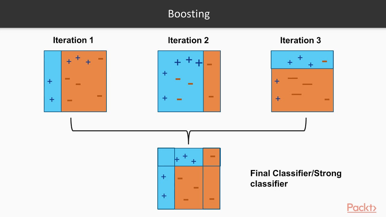
Image taken from a great video by Packt> : https://www.youtube.com/watch?v=BoGNyWW9-mE
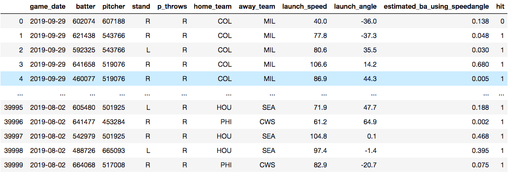
Now, time for an example. Below, you see a data set that I am using to train a model to predict whether or not a baseball player will get a hit. The model is trained on things like who the pitcher was, who the hitter was, how hard the ball was hit and at what angle the ball was struck. Essentially, I'm training a model in hopes that I'll later be able to predict what hitters will get hits against what pitchers. The data will need some tweaking to be sure, but for now, it's useful for this demonstration.
Vanilla Decision Tree
Training Accuracy: 100.0% Test Accuracy: 73.9% ------------------------------------------------------ Random Forest: Training Accuracy: 99.02% Test Accuracy: 79.11% ------------------------------------------------------ Adaboost: Training Accuracy: 80.13% Test Accuracy: 80.24% ------------------------------------------------------ In the end, we have some serious overfitting happening in the training of both the vanilla decision tree and the random forest, but we can see that the Adaptive Boosting model shows the best accuracy. An important point to note is the operational cost of boosting models. They take a lot of time. Training tree and tree and slowly making it just a little bit better each time will make for a long training time. Certainly there is a lot to dive into when it comes to evaluating a model, but I'll end it here. Try it out with your own datasets and see what results you can get. As a recent graduate of the Flatiron School's Data Science Program seeking my first real job as a data scientist, I'm full of questions about what day 1 on the job will look like. I've been a teacher for the past 8 years and I know what day 1 of school always looks like. But as a career changer actively applying to jobs, I'm entering new territory. Yes, I've worked on a lot of great projects, yes I'm confident I can make models, clean data, create engaging visualizations and present my findings to stakeholders. But, like, how do I actually get the data I need to work with on day 1? You may be just like me and wondering the same thing. Chances are very high your boss or manager at your new data science job won't send you a Kaggle link and tell you to download a nice, clean and structured .csv file. But, I have a feeling you already knew that. Here, I'll break down all the ways in which businesses and organizations gather data and those words you'll need to know when your given new responsibilities at your new job. Gathered Raw Data Data is the most important aspect of a data science project. That statement seems a little redundant doesn't it? But, people often forget the quality of a project or found insight is only as good as the data it comes from. That will often depend on where the data comes from. Here are the two ways in which data can be gathered. Captured data Gathered from direct measurement or observation, captured data is commonly found through surveying or experimentation. This is typically data that has intentionally been collected. Healthcare data such as blood-glucose levels can be accumulated through captured data from medical reports or readers for a specific study. But the data doesn't stop there, think of all the other data points that would be collected if we were intentionally capturing blood glucose levels. Exhaust data The extra data that is given off when intentionally capturing certain data points is known as exhaust data. These 'extra emissions' have been found, at times, to be more informative than the captured data. An example of exhaust data in our blood glucose levels data would be the age, the diet, the socioeconomic standing or smoker/non-smoker standing of the patient. A key to unveiling interesting findings is in the researchers ability to find the important exhaust data and put it to use. Practice Can you think of an example of exhaust data in the following places? - social media - bank statements - electric scooters  Knowing the importance of exhaust data is critical to drawing informative insights from captured data. Structured vs. Unstructured Data Now, that you know what kind of data you have and how it was acquired, it's time to clean it all up and turn it into a workable format. In a perfect world, we would all be working with structured data everyday. It would clean, labeled, sorted into nice rows and columns and would be found in relational databases or spreadsheets that would just need a SQL query or a pandas .merge() to prepare it. But, typically data comes in unstructured and sloppy. This would be like if a company were collecting loads of exhaust data and were unsure how they would use it, but collected it anyways. This brings up the question of how that data is then accessed by you, the data scientist, or stored by the company. Data Lake vs. Data Warehouse Raw unstructured data goes into a lake when it is being collected for no specific reason. This would commonly involve the collection of exhaust data. A data warehouse has more structure, more reasoning behind storing and organizing data. 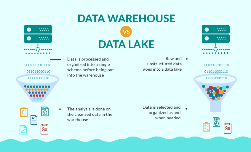 Source: Grazziti Supervised vs. Unsupervised Learning Finally, we get to talk a bit about modeling. Many data scientists would tell you that modeling is about 10% of their overall work. Let's put the details of this post all together with two examples. Example 1: You've downloaded a nice, clean .csv type and want to model with it. Q#1. This data is most likely what type: a.) structured data or b.) unstructured data? Q#2. This data is most likely held in a: a.) data lake or b.) data warehouse  Source: SEMrush Answers:
a.) structured data b.) data warehouse Nice work. This data has been collected and stored in a certain area for a certain reason and will most likely be structured data accessed through a relational database, perhaps using SQL querying. So, now all you will be able to model using supervised learning. You may created a training data set and a testing data set and you can created target variables where your ML model can learn from the training and apply what it has learned from the training to a test set. Example 2: This one is a little more difficult. You have someone at work come to you and ask you a specific question to analyze. Now, you have to figure out what data you will work with, where to get it and how to clean it and structure it for analysis or modeling. You will now diving down into the data lake and pulling out unstructured data, maybe exhaust data. So, how do you model with unstructured data? Instead of classification or regression, you now are trying to learn about the input variables and the structure in which the data flows in. For example, you could be utilizing K-means clustering or association learning. Once you learn more about your dataset and how it could be structured, you can move onto drawing insights. Hopefully this run-down of data types and structures will make you feel more confident going into the office on day 1. Don't be afraid to ask questions, don't be afraid to open up your notes and if your colleagues use a bunch of acronyms and words you don't know, write them down without them looking and google it. You'll be just fine. References: Structured vs. Unstructured data https://learn.g2.com/structured-vs-unstructured-data Supervised vs. Unsupervised https://machinelearningmastery.com/supervised-and-unsupervised-machine-learning-algorithms/ Data Lakes https://en.wikipedia.org/wiki/Data_lake https://searchaws.techtarget.com/definition/data-lake Now that you have gone through all the work of obtaining, scrubbing, exploring, and modeling your data with a neural network, how do you know it is tuned to produce the best results? Hyperparameter tuning is a necessary step in the iteration process of model creation. Since running a neural network model can be so computationally expensive, or time consuming, manually tuning different hyperparameters or running the model multiple times with different optimizers can be tough. With Talos, a few lines of code will allow for automated tuning while you go about doing other things. Grid Search Grid Search* is a technique that finds the optimal hyperparameters of a model by running the model with unique combinations of hyperparameters in order to make the most accurate predictions. * For more on GridSearch see the link in the Further Reading section below. Talos According to it's GitHub page, "Talos radically changes the ordinary Keras workflow by fully automating hyperparameter tuning and model evaluation. Talos exposes Keras functionality entirely and there is no new syntax or templates to learn." Essentially, Talos provides a template for your hyperparameter tuning needs. A long list of key features can be found on the Talos ReadMe page. But here, we will be working with GridSearch. In this case, I keep it simple with only 2 parameters being optimized: - batch_size: determines the number of samples that will be propagated through the network. - optimizer*: mathematical functions, each with different internal parameters that help minimize loss during the model's training process. * For more on optimization algorithms see the link in the Further Reading section below. Step 1. - Import Talos and set up your parameters for GridSearch. Here you can see that I've only chosen to test 4 different optimizers along with 2 different batch sizes. So really, all I'm trying to figure out is what batch size and optimizer combination works best? 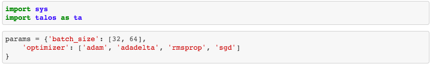 Step 2. - Create a function that will place your GridSearch parameters into the model. 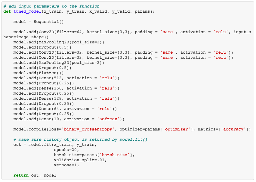 Step 3. - Use the function to run the model with GridSearch. Warning!: This will take a while. Seriously, like, a while. It would be best to run this at night before going to sleep or across multiple systems. If you are running this on a personal computer, be aware your computer will be out of commission for some time.  Step 4. - Interpret your results. This is a nice aspect of Talos. After running your model, which took forever (I tried to warn you!), you are able to quickly access all of your results. What you see here are the performance metrics for each combination of hyperparameters. In the case of this model, a batch size of 64 with an Adam optimization algorithm works the best. 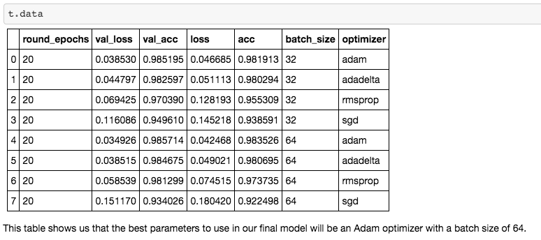 Hopefully, you will be able to use the Talos optimization platform with Keras to better optimize your neural networks. For background knowledge on GridSearch, Hyperparameter Tuning and Optimization Algorithms, I suggest reading more from the excellent Towards Data Science articles listed below. Further Reading
Grid Search for model tuning by Rohan Joseph, Towards Data Science. Simple Guide to Hyperparameter Tuning in Neural Networks by Matthew Stewart, Towards Data Science. Types of Optimization Algorithms used in Neural Networks and Ways to Optimize Gradient Descent by Anish Singh Walia, Towards Data Science. Analyzing baseball data is an excellent way to practice all skills required of an everyday data scientist. Every motion and movement of the ball and players on the field is coupled with some kind of data point. Baseball data will undoubtedly need to be cleaned and scrubbed no matter what source you obtain it from. The exploratory element can be a lot of fun for the creative and baseball knowledgeable analyst. But, the modern game of baseball has advanced so significantly because of the predictive power of baseball data and what can be hidden inside. In the end, whatever data analysis is done to a set of baseball data is directly transferable to any other type of data. The tools and skills are the same. Below, I'll showcase just that by showing how to merge data frames using pandas. 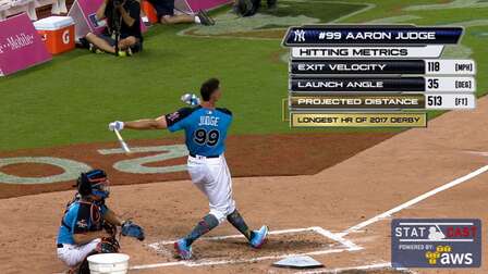 Aaron Judge collected all kinds of data points with just one swing in the home run derby. The Baltimore Orioles and the New York Yankees played a regular season game on August 14th, 2019. Let's start with a data frame that shows all the players in the line-up and on the field that day, their MLBID and their team. Note that depending on where you obtain your data, the player codes may be different. Here, I obtained this data from an MLB pitchF/X source, so the MLBID code is one that is unique to each player and significant to only MLB data. 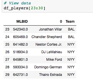 Now, let's say that we were given the data frame below. We were told that this is player value data from 8 players in the lineup that day. We are missing the player's names, but we have a "playerid" column. However, the playerID is different from the MLBID listed in the data frame above. Let's just say we were told that this data came from Fangraphs.com. We could have figured that out on our own with a little digging but I'll keep this simple. We need to merge these two data frames but we do not have a common column to do so. What can we do? 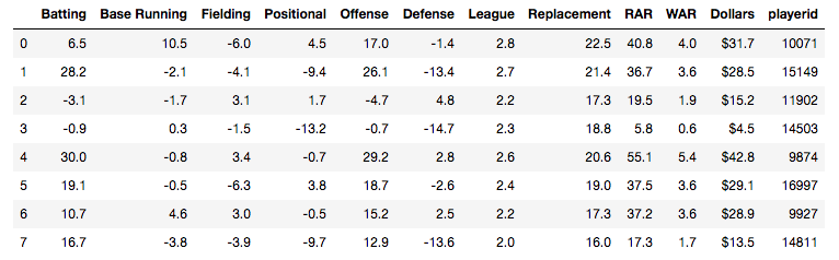 Luckily, there is a great resource on a website called Smart Fantasy Baseball that offers a data frame with a wide range of playerID codes for conversion purposes. We can download this information and use it to our advantage. Here, I download the .csv, import the data into a df and subset to only contain the MLBID and FangraphID codes that I need. In addition, I change the column names so that I can easily merge later. 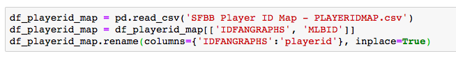 Now, I just need to convert the columns to strings in both datasets, utilize pd.merge and boom!, I've merged the playerID df and the Fangraphs df using the Fangraphs player ID column that was common to both df's. 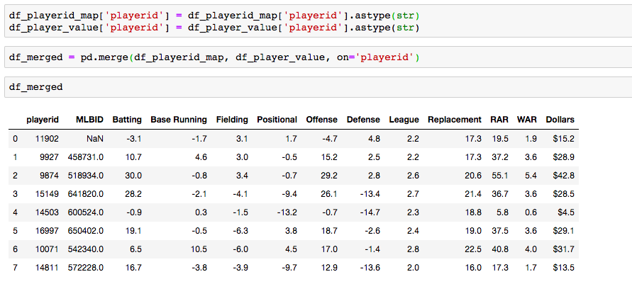 Remember when I said there will always be cleaning and scrubbing to do? Well you may notice above that playerID 11902 is missing and MLBID. This is a result of the playerID map that we downloaded being slightly out of date. A quick Google search and background knowledge of the Baltimore Orioles will tell us that Fangraphs ID code 11902 represents Hanser Alberto. We can then look up his MLBID and input that value manually. 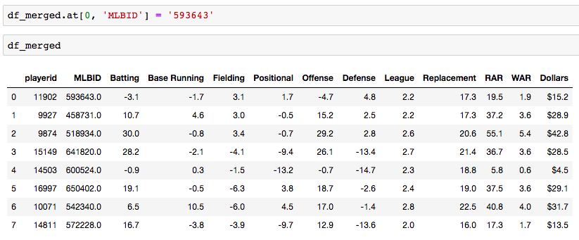 Now, our last step. We have merged MLBID's with FangraphID's in the step above. We still have our data frame that contains player names, their team and their MLBID. Our last step is to merge this original data with our newly merged df. 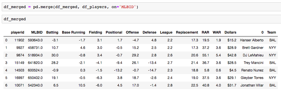 There you have it! We have successfully converted playerID codes and merged data frames with the help of Smart Fantasy Baseball's playerID map and Pandas! Perhaps next we can compare player value from the Orioles with player value from the Yank....no, no, let's not. I hope this helps you with any kind of merge or inspires you to start analyzing baseball data. Further Reading:
Link to my notebook. Pandas merge documentation. Interested in doing baseball research? Start with a few of these great sites! Fangraphs.com's leaderboards. Smart Fantasy Baseball. MLB PitchF/X Data. There are excellent blog posts written that visually break down the distinct layers of a convolutional neural network (CNN) and explain what is happening at each step. Great images like the one below, show us how a fully developed CNN is put together. 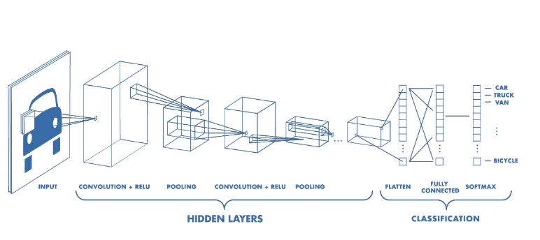 For this post, I will be explaining the layers of a CNN and writing a sort of glossary to a final CNN for an image classification model using the MNIST Fashion dataset. Rather then explaining the visual architecture of a CNN, I will be showing you my final model, which showed a 92% test accuracy and a 93% validation accuracy, and explaining the layers you see from a code perspective. For my full notebook, please visit my GitHub notebook Now, here is what my final model looks like: 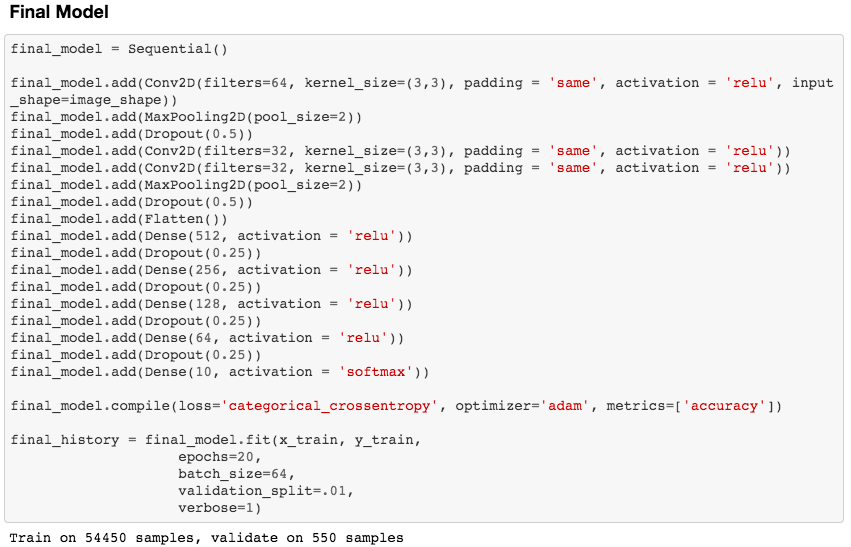 What will follow will be a glossary, not in alphabetical order, but in order as the parameters appear in my model. 1. What type of model? Sequential() - Generally, when building a model from scratch in which you choose what layers go on top of what layers, you use a sequential model. Using a sequential model is like making a pizza at home. The second option would be to construct a CNN using a functional API, or ordering out, in doing so, having more options for toppings and all those appetizers you just can't seem to make in your own kitchen. Functional API's give the data scientist more flexibility than the rigid, built from scratch, sequential model. For more on the differences between sequential models and functional API's click here. 2. The Convolutional Layer Conv2d() - This is the first convolutional layer. This is where a filter (shown in blue) strides across the image you are feeding the network. It performs what is basically the chain-rule and computing one number to represent, in this case, a 3 x 3 pixel section of the image and translating it to the purple square. This gives that section of the image one number. Once each purple square in the image below is filled in, you have a feature map. filters 64 - The first parameter in my Conv2d layer is filters = 64. This number refers to the number of actual filters I want to pass over my images. Each filter is randomly initialized and searching each image, learning about different features as it goes along. One filter may focus more on edges and lines. Another feature might be randomly initialized to focus on shapes. This means that within that first convolutional layer, we have 64 different filters passing over each image in our dataset. This number decreases to 32 in later layers. More can be uncovered here. kernel_size - this is simply the size of the filter that is being passed over the image. In most cases, we use a 3 x 3 filter or, kernel size. 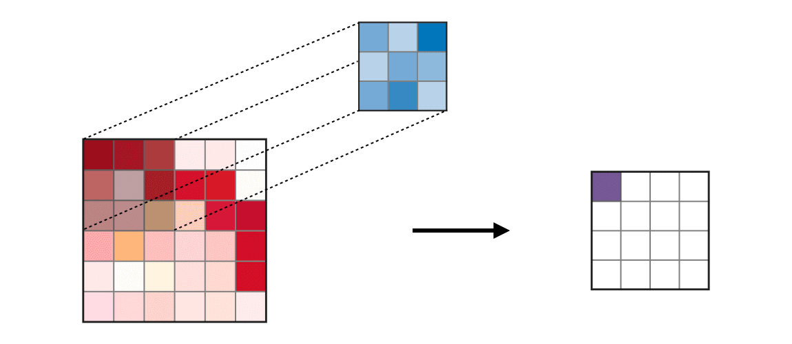 padding - In the image above, the dark red pixel in the top left corner will only be passed over by the filter 1 time. However, the orange looking pixel near the center of the image will be passed over much more than one time. This gives the orange pixel more weight when training. Therefore, padding sets a border of pixels with 0's around the image you are training on so that each individual pixel will have the same amount of time in the filter. The 'same' parameter simply allows the border of 0's to be the right size so the filter can move smoothly over the image and collect an equal amount of information about each pixel. activation - The final step in a convolutional layer is to send the inputs through a activation function. The ReLu activation function takes in a continuous variable input and outputs the same number, unless the input number is negative or 0. If that is the case, it will return a zero, giving it less importance and less likelihood of that neuron firing. This allows each node to have a number which in turn decides whether or not that node will fire when training on or testing an image. The continuous variable is passed through the activation function in order to decide whether or not to 'activate' that specific layer. 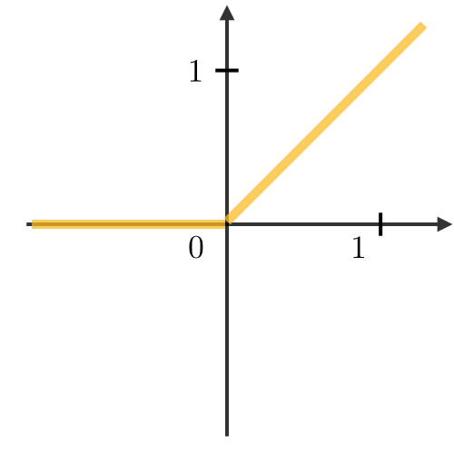 ReLu Activation Function https://stanford.edu/~shervine/teaching/cs-230/cheatsheet-convolutional-neural-networks 3. Max Pooling After our convolutional layer, we should have a series of filtered pixels, or the box above filled with purple boxes, or what we would call the feature map. Each image passing through each filter will have it's own feature map. This feature map needs to be downsized. Bring in the pooling layer. In my case, Max Pooling takes the maximum number in a 2 x 2 frame and creates what is essentially a new, smaller, more refined feature map. How do we know it is a 2 x 2 frame? Well you can see that in my model the pool_size parameter has been set to a 2, creating a nice 2 x 2 down-sizer to scan across our feature map. Here is a great place to learn more and another big shout out to the excellent tutorials written on Machine Learning Mastery. 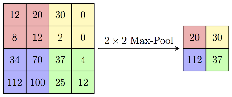 4. Dropout When training a model the CNN will go through forward and backward propagation. The dropout method is one that randomly drops out or silences a selection of nodes. Why do this? It helps with overfitting of course. When certain trained nodes are randomly dropped out, the nodes that are left have to pick up the extra work load. This leads to the network becoming less sensitive to individual nodes and more diverse, leading to a less likely situation where over fitting and relying on certain nodes to over train could occur. You'll notice that I have a few dropout layers in my model, each dropping out 25% of the nodes in my network. Here is a great resource that explains more. 5. Flatten This is a simple step that takes a feature map or a pooled feature map and converts the digits into a single column array to prep the data before it enters the dense layer. 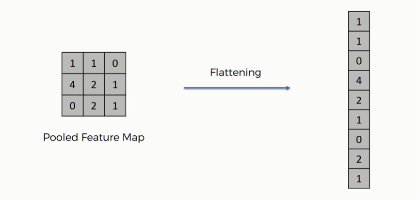 6. Dense layer This final layer uses a soft max activation function to generate 10 outcomes or our 10 categories for classifying our data. This will be the final, spit out a number type of layer. It creates a vector of probabilities as to what the image should most likely be classified as. Conclusion These neural networks can be very complicated by their very nature. Breaking down each layer and then further breaking down the parameters involved in those layers can be a very helpful approach to better understanding the overall network. I hope this helped give more insight to each of those things. Sources:
https://towardsdatascience.com/the-4-convolutional-neural-network-models-that-can-classify-your-fashion-images-9fe7f3e5399d https://adventuresinmachinelearning.com/keras-tutorial-cnn-11-lines/ https://forums.fast.ai/t/dense-vs-convolutional-vs-fully-connected-layers/191/3 https://adventuresinmachinelearning.com/keras-tutorial-cnn-11-lines/ https://www.superdatascience.com/blogs/convolutional-neural-networks-cnn-step-3-flattening https://towardsdatascience.com/activation-functions-and-its-types-which-is-better-a9a5310cc8f https://stats.stackexchange.com/questions/296679/what-does-kernel-size-mean/339265 https://machinelearningmastery.com/dropout-regularization-deep-learning-models-keras/ https://dashee87.github.io/deep%20learning/visualising-activation-functions-in-neural-networks/ https://stanford.edu/~shervine/teaching/cs-230/cheatsheet-convolutional-neural-networks Predicting Gold Glove Award Winners using Machine Learning
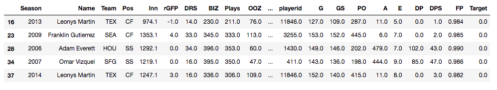
Can machine learning algorithms predict which MLB players will receive Gold Glove Awards at the end of a season? The Gold Glove Award is given to the best defensive player at each position in each league at the end of every season. Advanced metrics and traditional statistics were combined into a data table showing MLB players and their end of season stats from 2002 - 2018. The target column shows a 1 for a player who received an award and a 0 for players who did not. The data used for this classification model can be downloaded in .csv format here:
Choosing the Right Model
Now, I have my data all ready to go. I have my target column. I have also taken the steps as follows:
- drop.na() to remove any null values pertaining to catchers. The final data frame will only be learning on 7 fielding players (1B, 2B, SS, 3B, LF, CF, RF) - one hot encode to get dummies and create categorical values for position columns - separate out features and scale the data - Train/Test split at .75/.25 So, what's next? I've done a lot of work and I haven't begun any learning with machines yet. Where do I start? First off, it's important to know which algorithm to use. With so many models to choose from, you could spend all day running models and checking to see how they perform. But here I'll break down two. We will compare a baseline (or, Vanilla) Decision Tree model with a Random Forest model to see how each one performs and which will be a better model for our data. Decision Trees
Imagine that you are walking through the woods with a tree identification guide. All the trees in the woods are of the same species. They look the same, they smell the same, they have the same leaves. Let's say you are trying to identify this type of tree. You open your book to the first page and look at the tree in the picture. You start with the leaves. The picture in the book has 5 pointed, star-like, looking leaves. The tree you are standing under has round smooth leaves. The leaves just don't match up. What would you do? Hopefully, you wouldn't immediately give up because tree identification can be tough, but you instead turn the page to see if the next tree in the book can narrow your guesses down.
This, in effect, is what a decision tree does. Try not to get too confused about the tree metaphor being used to explain a decision tree. The point is, you start somewhere and answer yes/no, if/else questions to narrow down your classification. The decision tree algorithm does just the same thing. Using the tree identification metaphor, the leaves, the bark, the height, the smell, these are all features that you are using to predict a target, or the tree species. The algorithm does this with the features in your data set and passes them through the tree until a stop criteria is met. 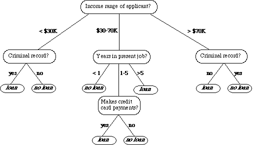
An example of a decision tree., Ref: TowardsDataScience.com
Here is the code used to run a baseline Decision Tree on my data:
A Random Forest
In the case of this project, we are working on a classification task. A Random Forest is essentially a collection of many Decision Trees and is an ensemble of a Decision Tree. Imagine now you're hiking through the woods and you stop to observe the trees in a new forest. You may see some spruce, some pines, some holly, some oak and maybe even some aspen (Aaahhh...) Though it sounds more like you would be walking through an arboretum than a wild forest, in technical terms, you are in a Random Forest Algorithm. But don't worry, there are no wild beasts to be afraid of.
In our metaphor you are now walking in a more diverse forest with many different species of trees. So, a Random Forest uses a varied approach to making decisions. It does this in two ways, bagging and subspace sampling. Bagging Just like different trees (pine, spruce, oak) will contribute differences to the forest, the bagging technique encourages differences when interpreting the data. Simply put, each tree is given a 'bag' of data. But, each bag is separated into it's own little training/testing subset. So, just like each tree in the real-world forest has different qualities, each tree in the algorithm has different samples of data from which to make decisions. Subspace Sampling In the same way bagging takes small portions of data to feed to each tree at random, subspace sampling feeds each tree a subset of features to train the tree. Think of this as each species of tree in the forest receiving a different amount of nutrients, sunlight and water. The algorithm is feeding different features to each tree in the model. The model then combines all trees in the forest to create a diverse and differentiated classification model.
Here is the code used to run a Random Forest on my data:
Evaluating and Comparing the Models
So, there you have it. Our data was split, each model was trained and used to predict which players should be receiving awards. Let's take a look at how we did.
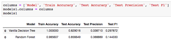
Analyzing and Comparing the Metrics
Accuracy
The 100% training accuracy can be ignored for the Vanilla Decision Tree. This is a result of training the model on the same data that it is being tested on. A great discussion of why this happens can be found here. The fact that the Vanilla model has 100% training accuracy and the Random Forest has a 98.5% training accuracy proves that the bagging and subspace sampling techniques are being used in the forest algorithm. The real column to look at above would be the Test Accuracy. We can see that using a Random Forest adds nearly .03 accuracy to our testing set. This shows how the randomness and diversity in decision making of the Random Forest can boost your testing accuracy. Precision In my Gold Glove Award classification model, I wanted to improve on precision as best I could. In this case, let's say my model predicted 100 players who should receive the gold glove and only 38 of those were accurate. Thus, giving us the .388889. Certainly we would hope that hyper-parameter tuning on the Random Forest would improve our precision, but it is better then the decision tree. Hopefully, this gives you a nice understanding of the difference between these two models and how an ensemble method, such as a Random Forest, can contribute to more predictive models. The full repo for the Gold Glove Award Winner classification project can be found here: https://github.com/lucaskelly49/dsc-3-final-project-online-ds-sp-000/blob/master/Student_Final.ipynb Introduction As the reach and expansion of the web continues to go in a seemingly limitless direction, data managers are looking for ways to keep tabs on datasets and manage them in a way that can be accessible and useful to humans. This is especially true of environmental data, where the research and findings that utilize this data become more and more critical to humanities existence on this planet. As climate change evolves, natural disasters become more prevalent and powerful, and policy makers look for ways to adapt to our ever changing world, it becomes increasingly more important for researchers and data scientists to share their work. A paper written by researchers promoting the environmental data portal, EnviDat, developed by the Swiss Federal Institute for Forest, Snow and Landscape Research (WSL). Here, I'll break down this paper into a few key points and take aways that can be valuable to any environmental data scientists or stakeholders in environmental research. The importance of research data management communities EnviDat creates a unified and open sourced environment for data collected by WSL to be stored, downloaded and accessed by users around the world. Many organizations are shifting to a open-sourced and user friendly data management system and the field of environmental research and data management is no exception. In fact, the critical nature of finding ways to accomplish things like fresh water resource security, food security, natural disaster prevention and relief, make it more important than it's comparable fields. EnviDat provides this service for environmental researchers. According to it's promoters, "EnviDat supports data producers and data users in registration, documentation, storage, publication, search and retrieval of a wide range of heterogeneous data sets from the environmental domain." In addition, data storage, safeguards and availability are all factors that complicate the field of data science. With EnviDat, "the data layer bundles the PostgreSQL databases, the extensible virtual storage for the file repository, and the infrastructure mechanisms for ensuring the safety of the metadata and data such as backup and mirroring." 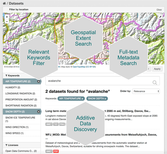 A view of EnviDat's user friendly interface. Taken from: https://datascience.codata.org/articles/10.5334/dsj-2018-028/ Infrastructure, Framework and Guiding principals
The importance in joining of joining a community such as that provided at EnviDat are not confined to accessibility and storage. In fact, a more important point would be the way that community formalizes the process, so that sharing results, comparing analyses and communicating findings can be more efficient around the world. EnviDat creates a system in which users can create a "registration, a data repository, a controllable publication process, easy data discovery, provision of persistent identifiers and an overall user-friendly experience." With an infrastructure that is organized and user friendly, there must also be principles that users sign on to abiding by. These included, "unified data access, distributed research data management, selective registration and integration of data sets and curated data which can be summarized under the motto 'unified access, distributed curation'." But users can also be expected to follow the motto, "share as much as possible, conceal as much as necessary" According to researchers, EnviDat and WSL "will make its research data accessible within two years after the completion of a research project or a program phase for long-term research programs and monitoring projects." Finally, in order to make the user experience more uniform, "formal publication of research data with assignments of proper citation information using Digital Object Identifiers (DOIs)" is expected for users. In addition, the use of repositories allows "data to remain close to the data producers and experts, which can help establish direct contacts between data users and producers and foster scientific collaborations." Why EnviDat? For any environmental organization, finding the right data to analyze can be a challenge. The community create by EnviDat is the step in the right direction for researchers who are doing such impactful work. This idealism can be summed up in the author's closing words. "Developing an institutional portal for environmental research data also forces us to reflect upon the future. Creating a zoo of unconnected web-based data portals worldwide will limit their usability and, in fact, might even reduce their usefulness and service to the science community and the public. Therefore, we consider it important to coordinate and connect between the various initiatives in order to avoid fragmented parallel developments." A/B Hypothesis Testing on this database proved to be more challenging than I initially thought it would be. I'm good at asking questions, I like using SQL and math is my thing. But this project had me sitting and thinking quite a bit more than I bargained for. In a previous project where I was creating a multilinear regression model on King County Housing Data, there was a lot of step-by-step work like cleaning data, checking for multicollinearity, normalizing and transforming data, selecting features. This one was more thought oriented and, dare I say, experimental. Asking the right questions was the key. But, then again, asking the right questions takes some time. Here, I'll show you the question that I enjoyed asking the most and my process in finding the answer. First, the Northwind Traders database is one that was created by Microsoft to exemplify a company database and have users practice pulling data from it with SQL queries. Here is the entity relationship diagram (ERD) that visually explains how the database is organized. 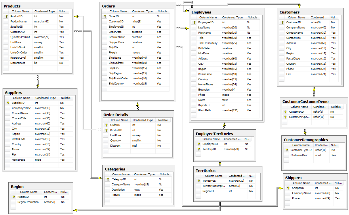 STEP 1: Ask a relevant question that could potentially drive a business decision and be advantageous for the company. Finding questions that compare the means of two distributions can be overwhelming when looking at a complex ERD. But, take a deep breath and focus on what is important to the business. In my case, I wanted to ask a question that focused on the employee and their success in the company. As administrators and managers are always looking to increase sales, while also walking the fine line of overburdening their sales employees with more customers to manage, this question can show whether or not adding large customer areas (in this case regions) might add more sales. With territories all over the world, the Northwind Traders company has 9 employees who have anywhere from 2 to 10 different regions they are responsible for. Here, I ask the question as it pertains to the employee and their region amount. Question: Do employees who cover more territories sell higher quantities of products? Hypothesis: Null: There are no significant differences in the employees who cover a larger amount of territories (more than 6) than the employees who cover a smaller amount of territories (less than 6). Alternative: There are significant differences in the amount of products sold by employees with a larger amount of territories than employees with smaller amounts of territories. STEP 2: Gather the necessary data to analyze your question. Using SQL queries to pull down the data in a workable format is necessary in this case. It is necessary to create data frames with useful information that can be analyzed in statistical tests. For this question, I needed data on the employees, the territories they oversee and the details of their orders. 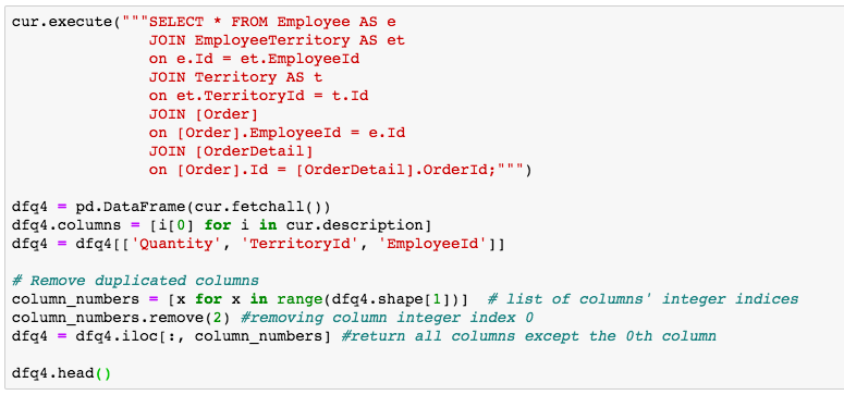 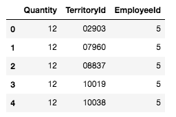 STEP 3: Break your data down into control and experimental groups. Here I designated employees with more than 6 territories as the experimental group, leaving those holding less than 6 territories as the control group. For each group, I gathered the quantity of each sale they made and took the averages of both group quantities. 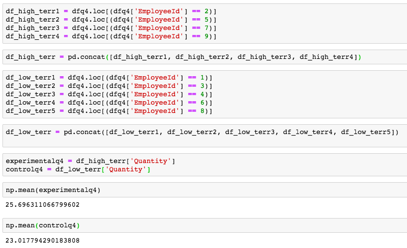 STEP 4: Check to ensure the data is normal and visualize the distributions. A two sample t-test relies on the data distributions being normal. Here, I've used qq plots to visualize the normality of the data. 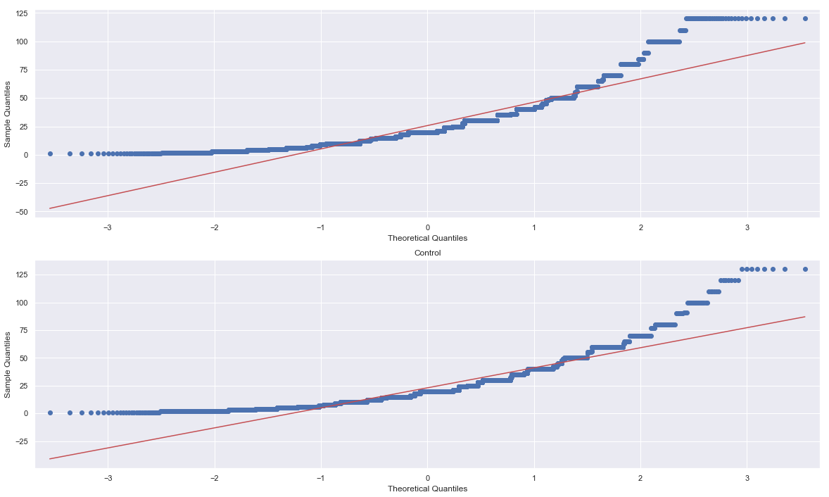 A check on normality using qq plots. 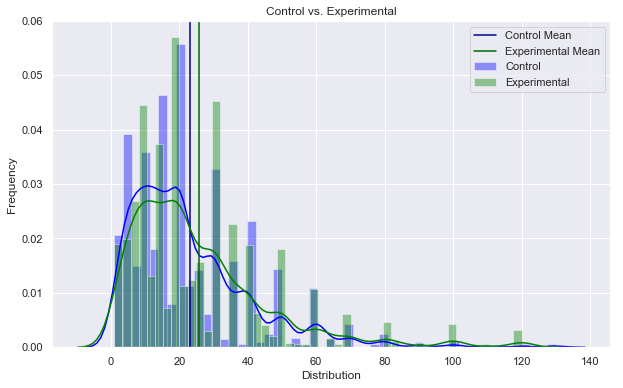 A visualization of the compared distributions. STEP 5: Run the experiment and interpret the results. Using the two sample t-test, we look to see if the p value is greater than the alpha value, in this case 0.05, to reject the null hypothesis. But, if the opposite happens and the p value is less than the alpha value, we accept the alternative hypothesis and determine what the statistical difference is. 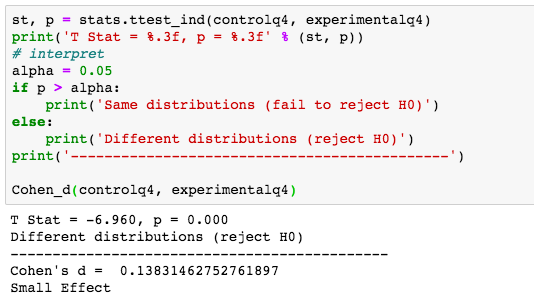 Given our results we can see that the null hypothesis has been rejected and that there are significant differences in the quantity of sales between high and low territory employees.
To wrap up, the question to ask is, what business questions does this answer? Well, let's say one of our younger employees has shown a lot of potential and management is interested in giving the young fellow more responsibilities, even, a whole new territory! With the results of our test, we can be confident that giving the up and comer this promotion could lead to more sales. Full Git Hub Repo: https://github.com/lucaskelly49/A-B-Hypothesis-Testing-on-NorthWindTrade-Database/blob/master/Student.ipynb A few sources: https://machinelearningmastery.com/nonparametric-statistical-significance-tests-in-python/ https://www.datanamic.com/dezign/erdiagramtool.html https://towardsdatascience.com/inferential-statistics-series-t-test-using-numpy-2718f8f9bf2f https://blog.minitab.com/blog/adventures-in-statistics-2/choosing-between-a-nonparametric-test-and-a-parametric-test |
|||
 RSS Feed
